

- Home >
- CIT >
- Website Development
- > How to Add and Edit Components
How to Add and Edit Components
File/Image Upload Form Elements
How to Add a Component
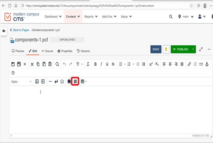
1. Click on the component icon  located on the toolbar inside the editor.
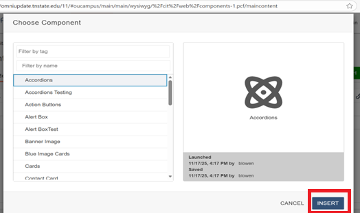
2. Select the component you want to add and click on "Insert".
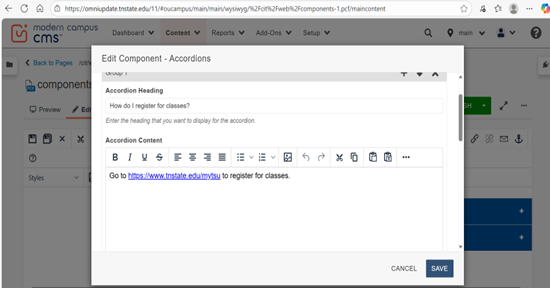
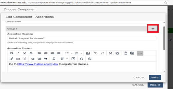
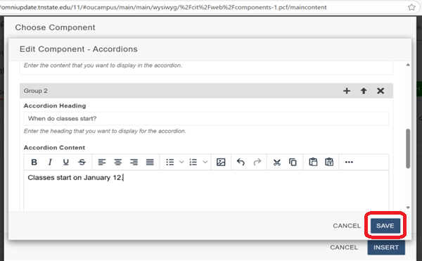
3. Enter the content in the form elements. For example, in the accordions component, enter the text you want to display for the button in the "Accordion Heading" element. Then enter the content you want to display inside the component after the button is clicked on in the "Accordion Content" element.
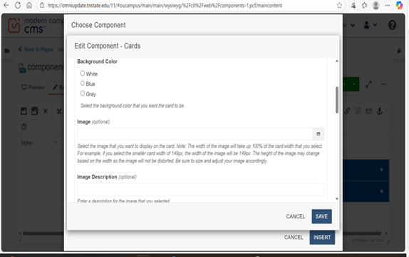
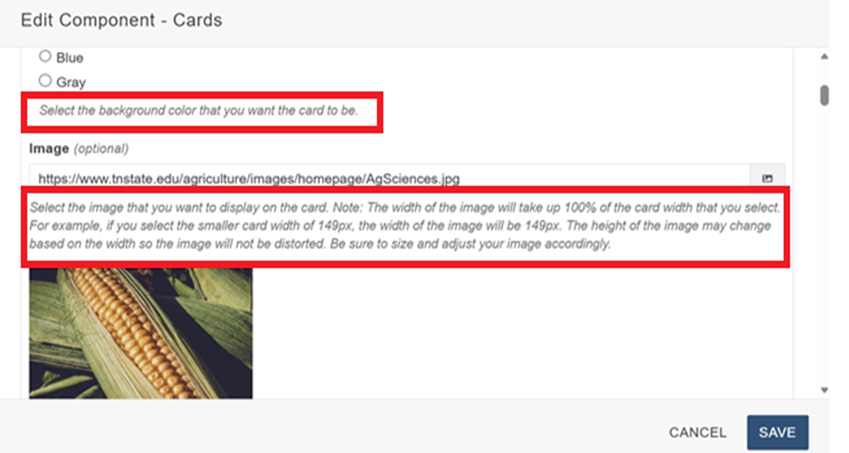
Helper text may be displayed below each form element that explains what to put into each element or helps with the content (such as image sizes).
Some form elements are not required (it will say optional in parentheses) so you will not have to input these unless you choose to. Read the helper text carefully to understand what elements you want to display on the component.
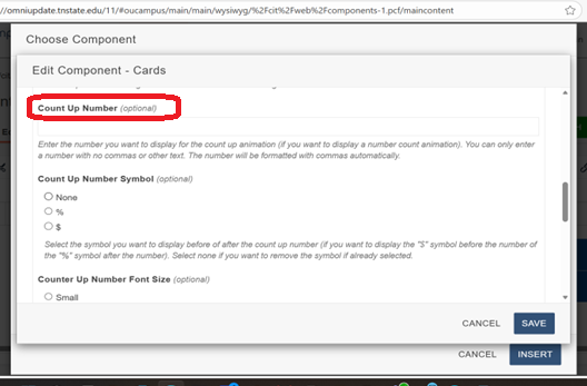
There may be different types of form elements on a component such as a dropdown menu, radio button, text input, date/time selector, image or file uploads, etc.
Form Element Groups
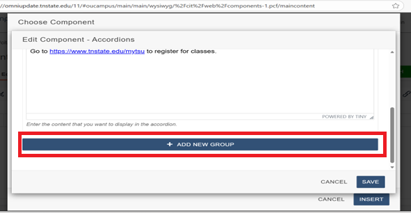
Click on the "+" icon or click on the "Add New Group" button at the bottom if you would like to add another group. For example, in the accordions component select one of these buttons if you would like to add another accordion as shown below. Then enter the content into the form elements as shown above. Repeat this process to add more groups. You can add as many groups as you need.
Note: Not every component will have the option to add another group.
Reorder Group Form Elements
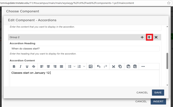
If you want to reorder the elements, click on the arrow icon as shown below to move an element.
Delete a Group Form Element
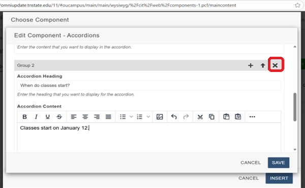
If you want to delete a group element, click on the "X" icon as shown below.
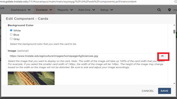
File/Image Uploads on Form Elements
On form elements with file or image uploads, select the image icon to insert an image or file. You can also directly input the image or file path if you are linking to an external site.
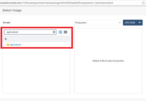
Navigate to your department directory by typing in the directory name. For example, if you are in the agriculture department, type in agriculture or browse to and click on the folder named "Agriculture". Click on the folder with the correct department name.
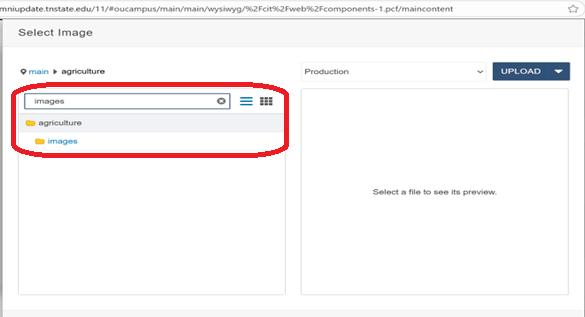
Navigate to the folder where your images are stored. Usually, this is in the images folder.
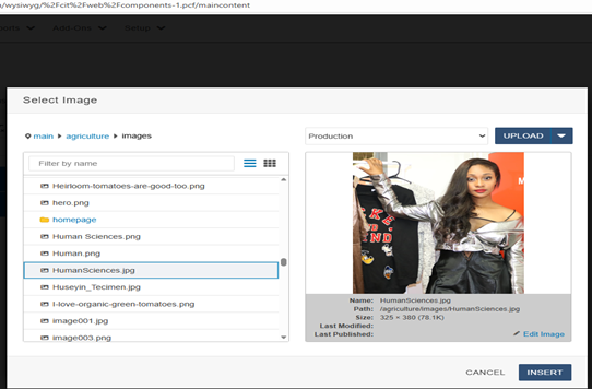
Select the image you want to display.
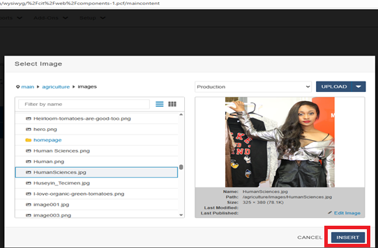
Click on the "Insert" button.
Component Preview
When you are finished adding all your form elements and content, click on the "Save" button.
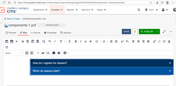
The component will then be displayed on the page.
Save and Publish the page like normal once finished.
How to Edit a Component
Open the editor and click on the component you want to edit. Then click on the "pencil" icon
 as shown below.
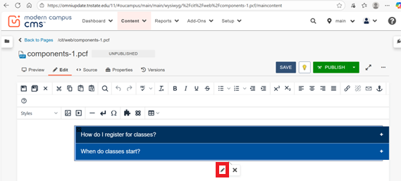
The component will then open and you can edit the content and elements the same way as shown above.
Note: You may instead see a blue placeholder as shown below depending on how the component is configured.
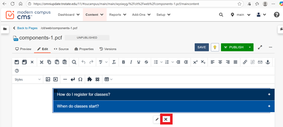
How to Delete a Component
To delete a component, open the editor and click on the component you want to delete. Then click on the "X" icon
 as shown below.
Video Instructions
https://www.tnstate.edu/cit/videos/Components.mp4
Component Examples